Olee Kelaa by The Divia: Brand Identity
A sub-brand identity for a Haa Alifu guest house, rooted in The Divia’s bird mark and a gold palette drawn from the island.
At a glance
- Client
- The Divia
- Type
- Branding
- Sector
- Hospitality
- Year
- 2026
- Disciplines
- branding, graphic design, consultation, creative direction
The brief
Olee Kelaa is a new guest house in Kelaa, Haa Alifu Atoll, and the latest property under The Divia. The Divia is a growing hospitality brand with its own credibility and its own bird mark. The question was how a single property could belong to that family and still feel like itself. The identity had to carry The Divia’s standing and express Kelaa’s own character. It also had to work for a small guest house, from a business card to an Instagram post, without losing the unhurried, personal feel of a place run by people who know the island.
What we made
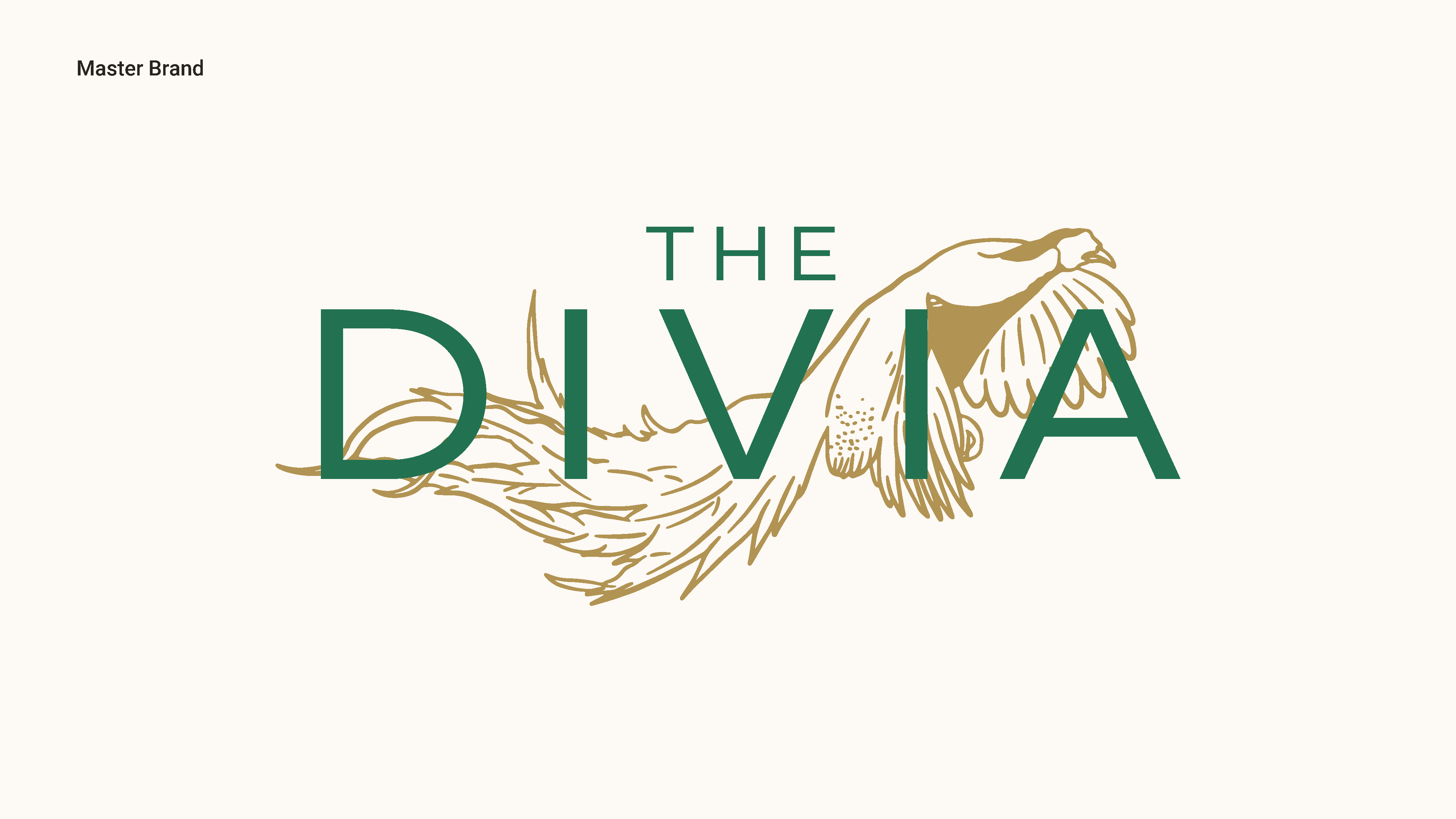
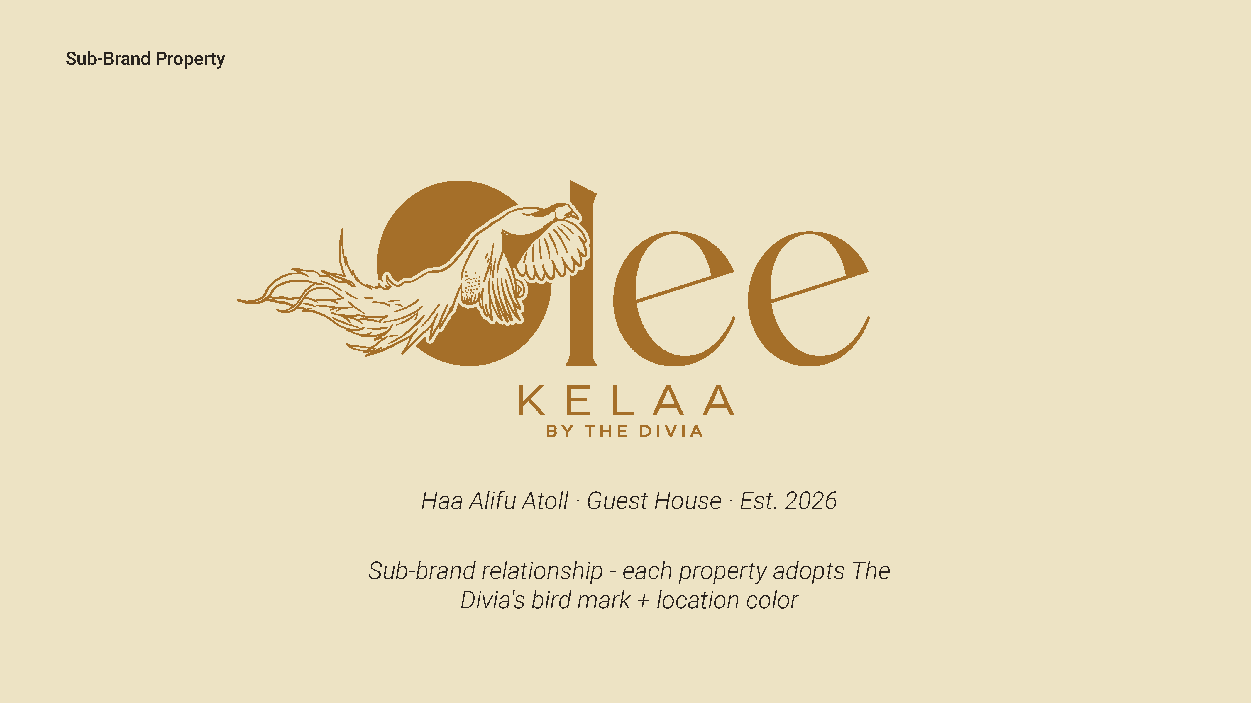
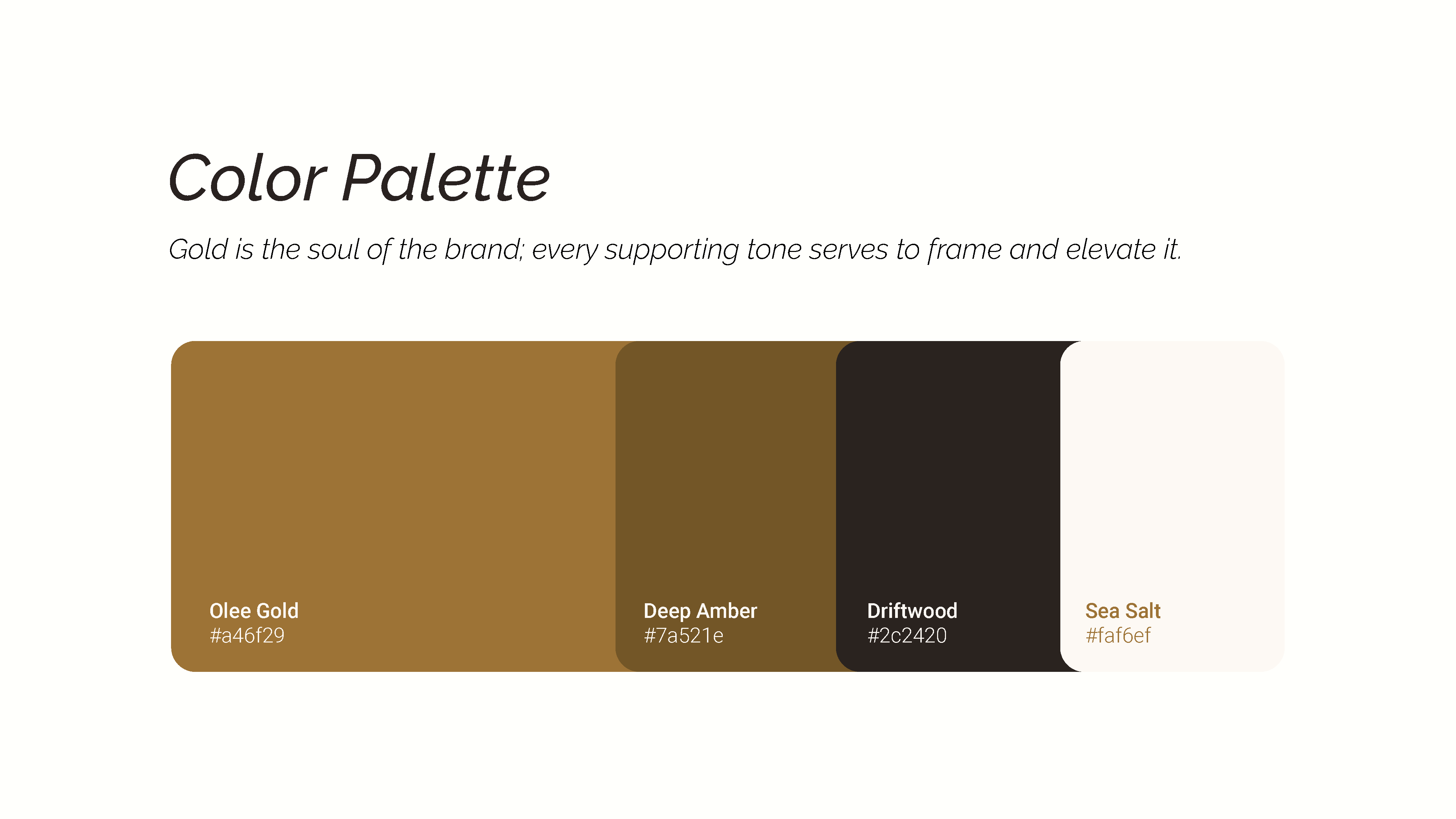
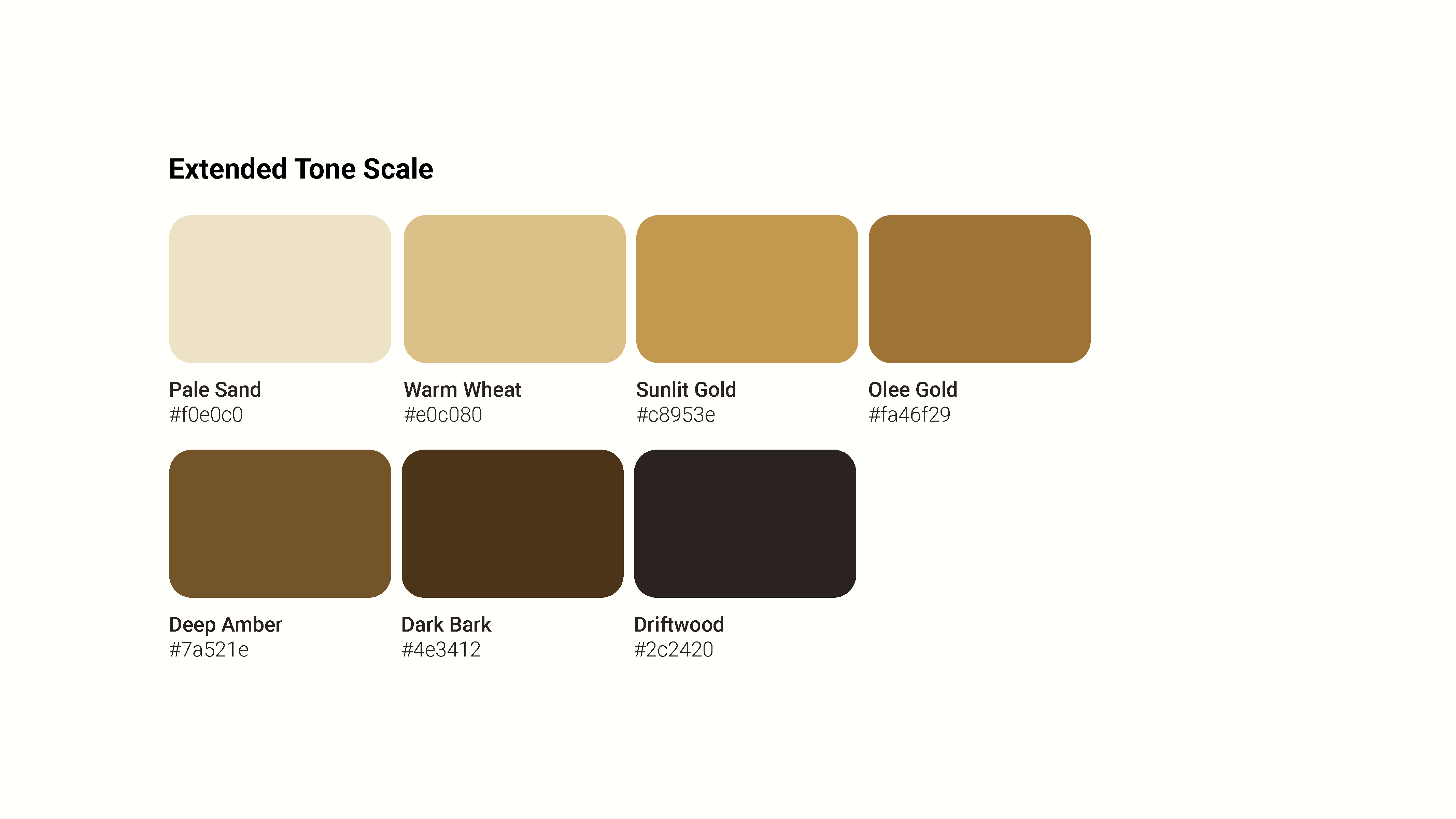
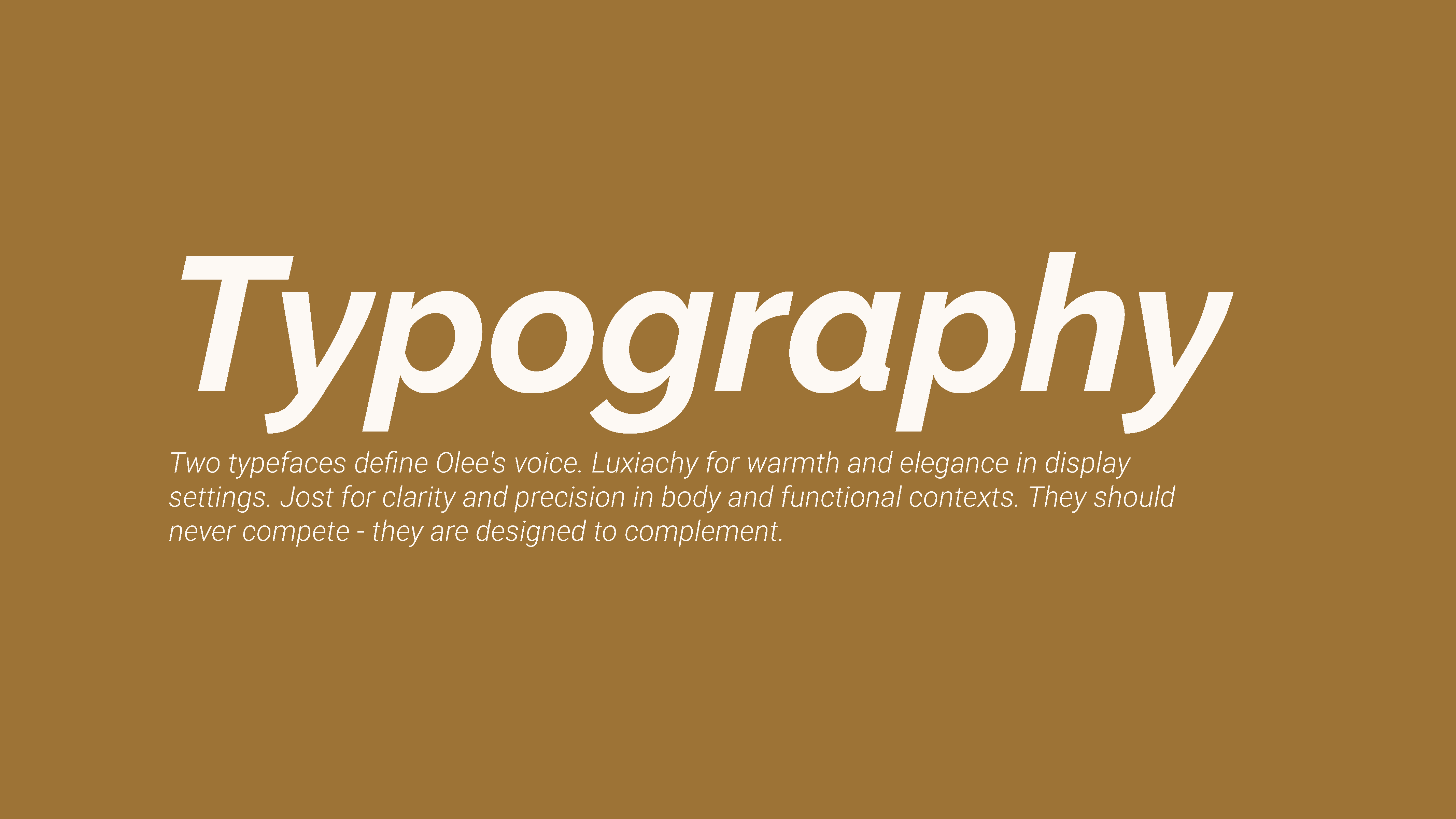
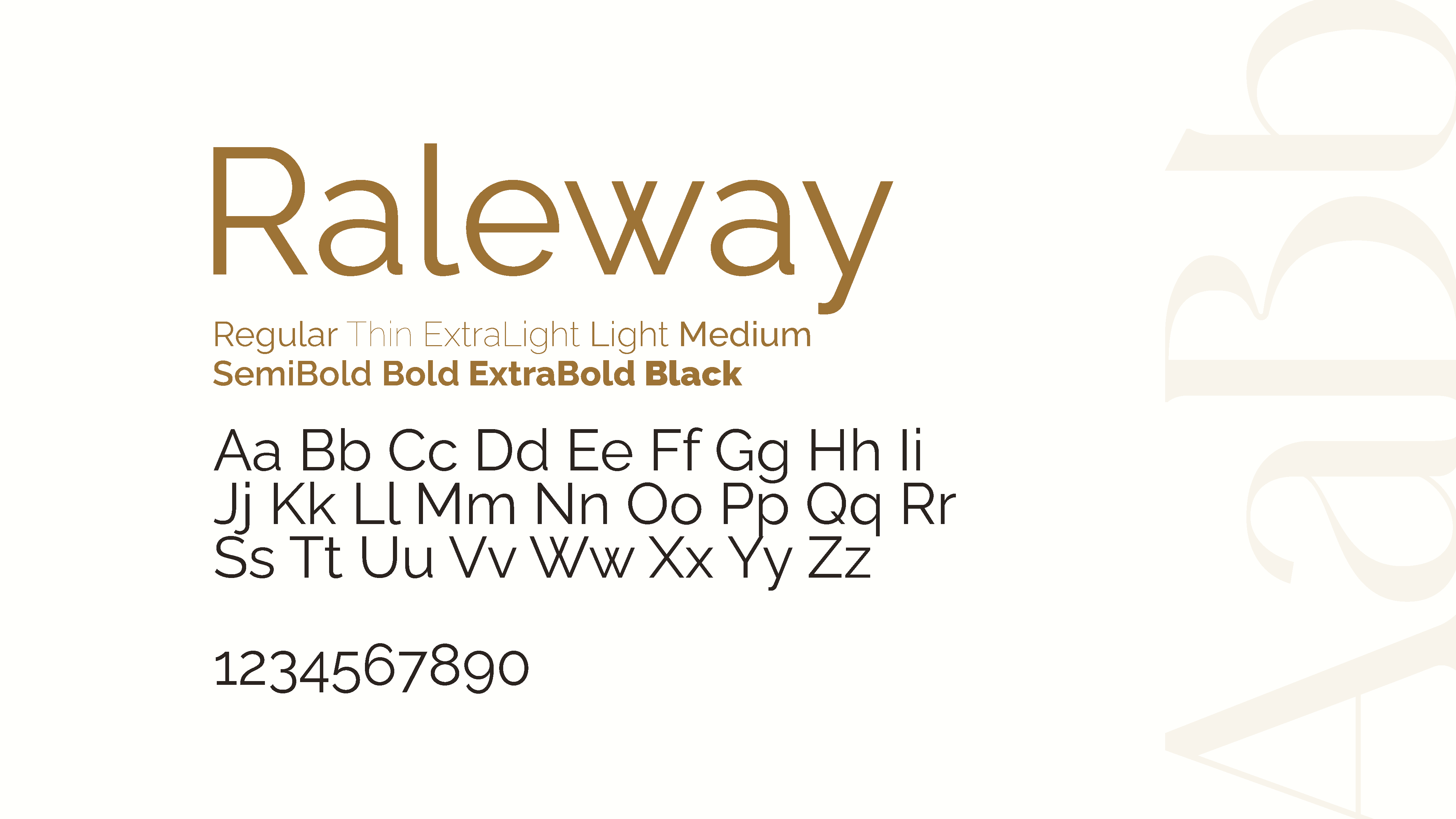
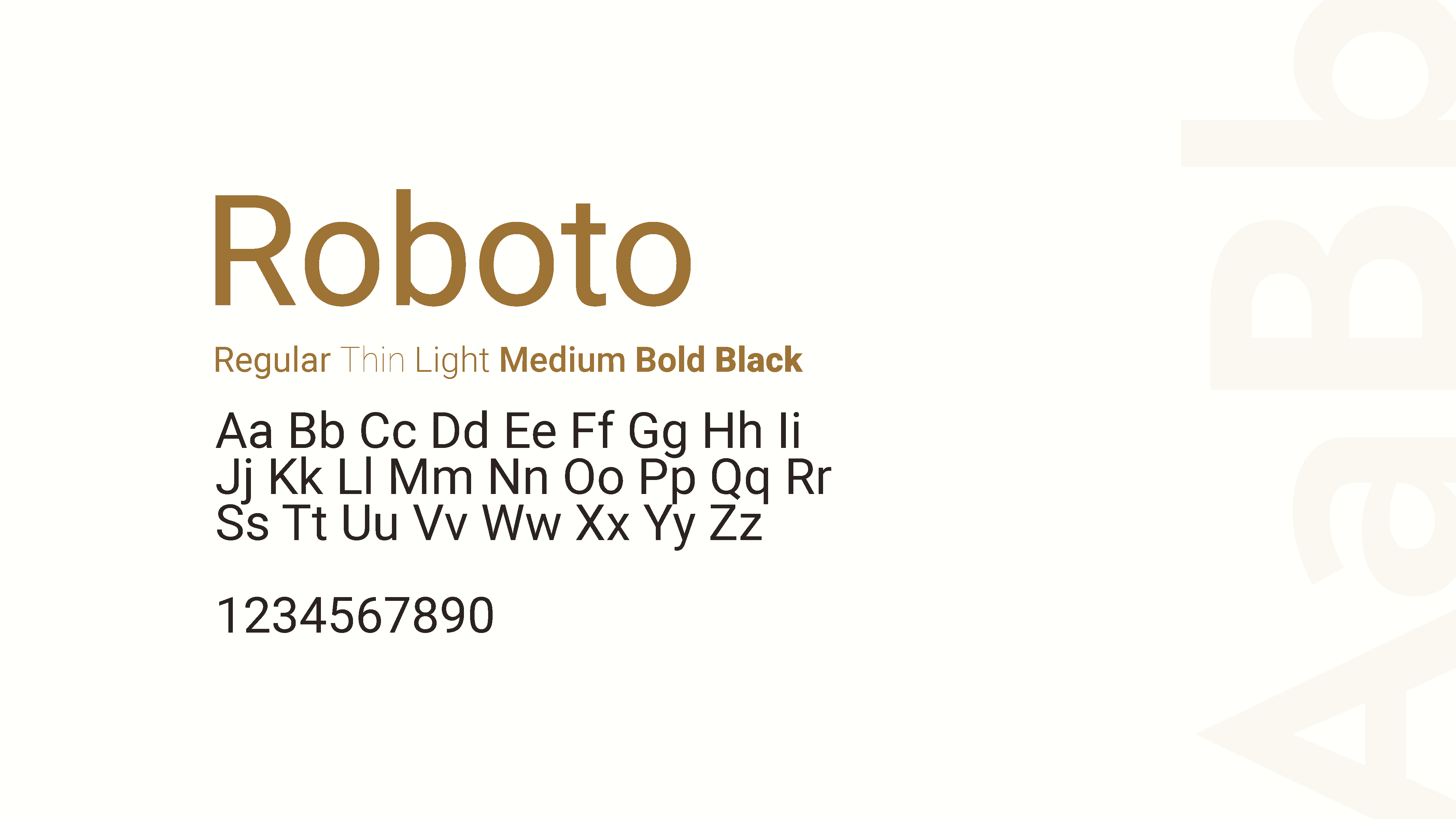
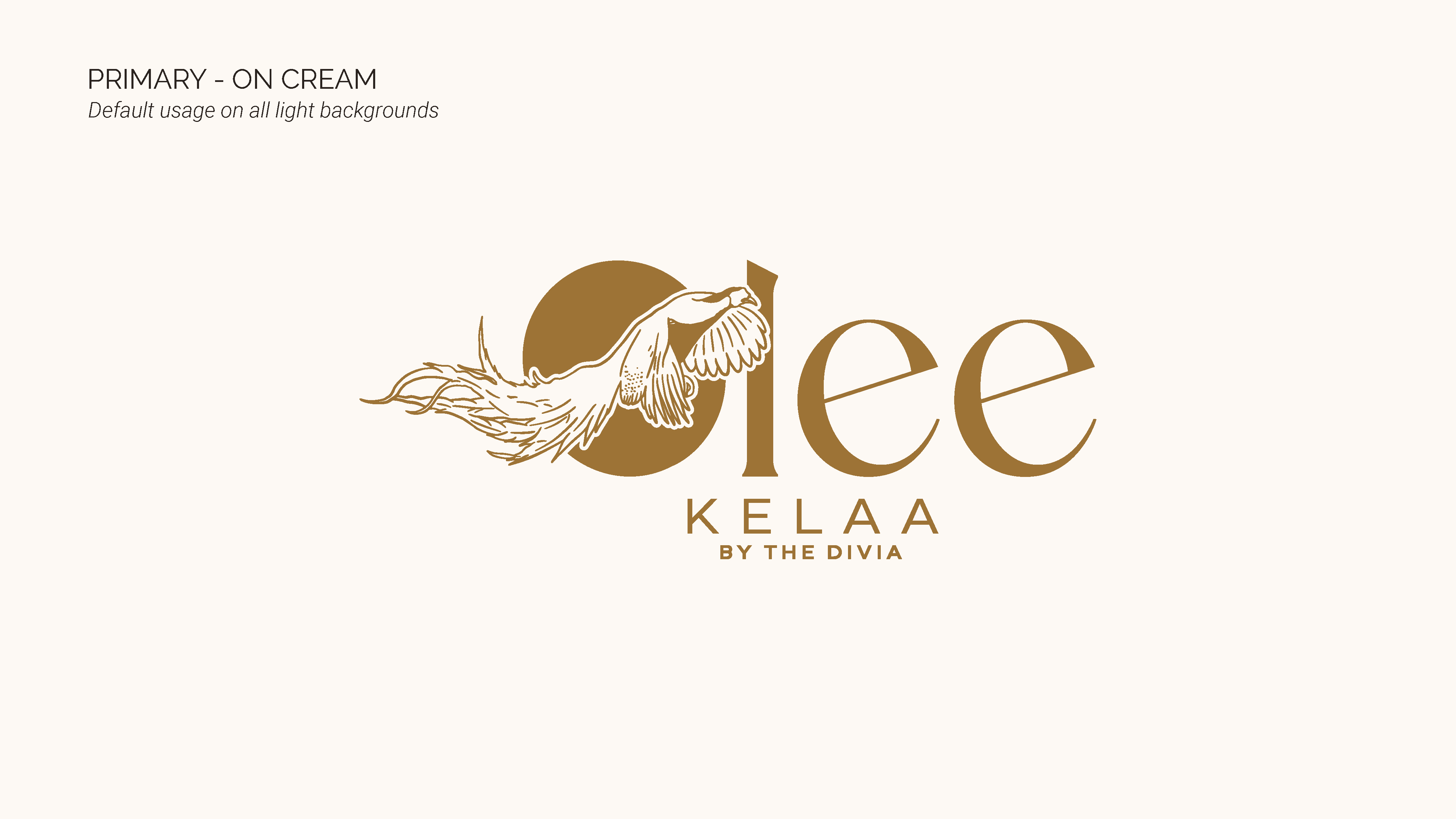
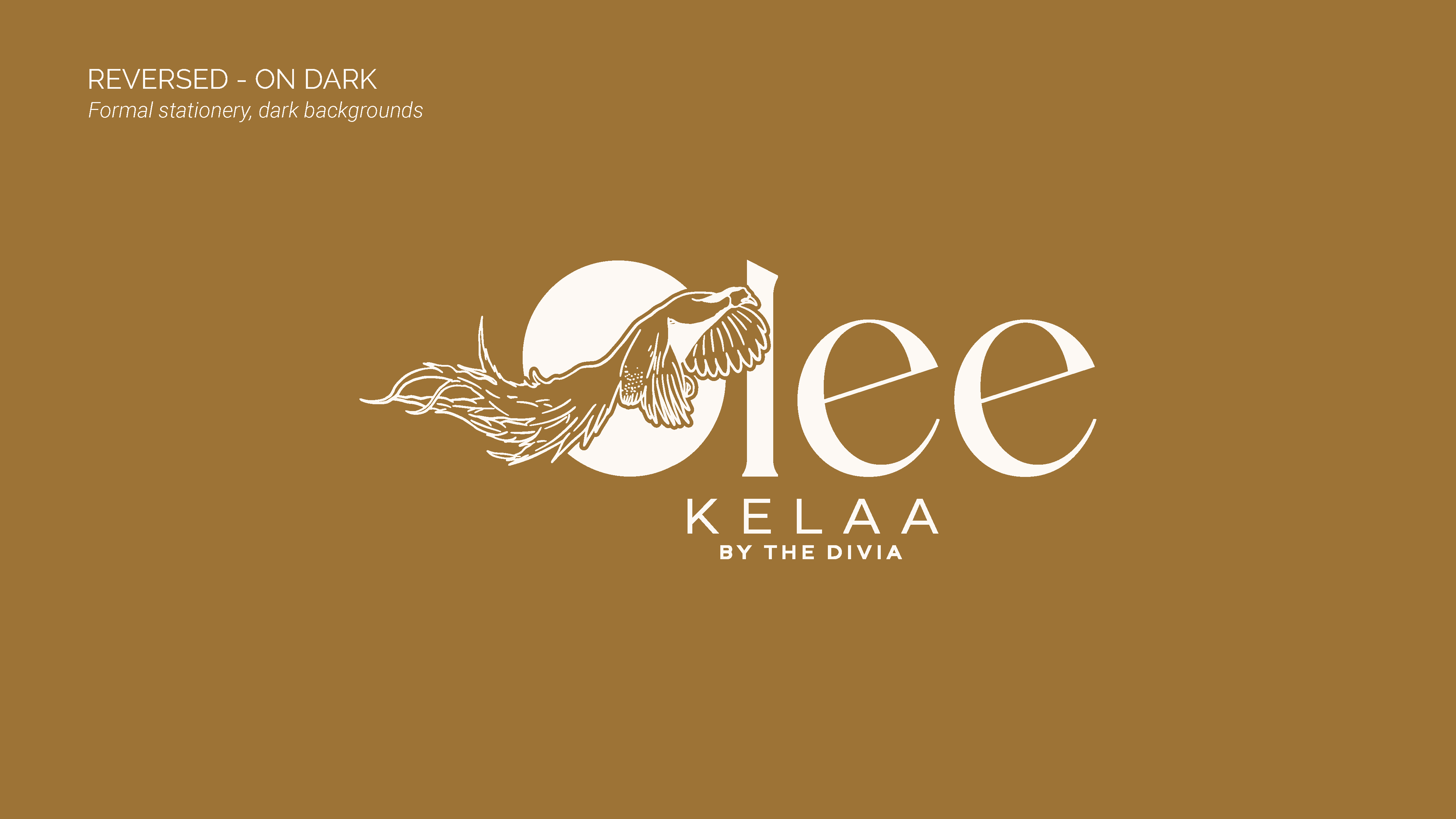
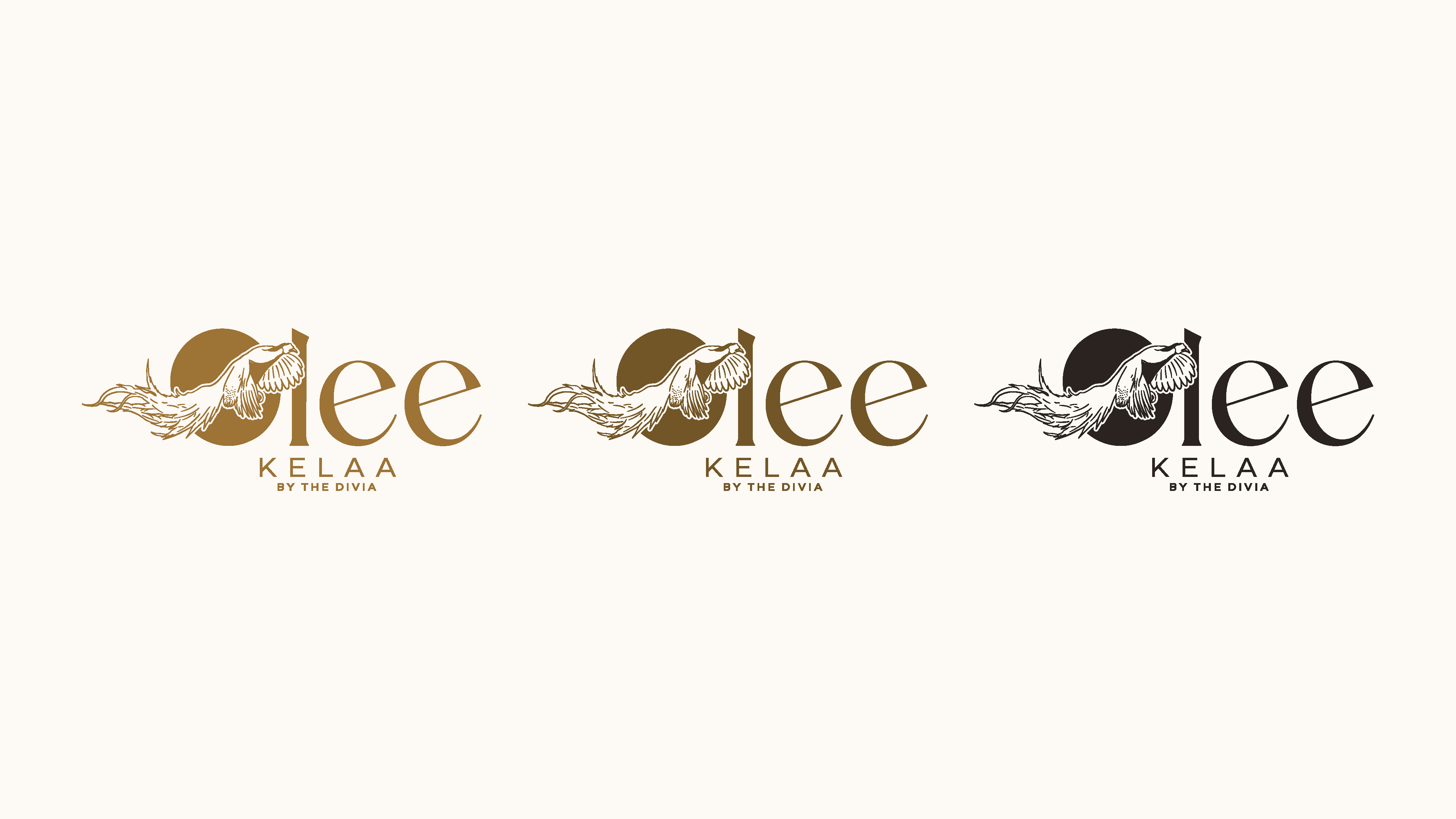
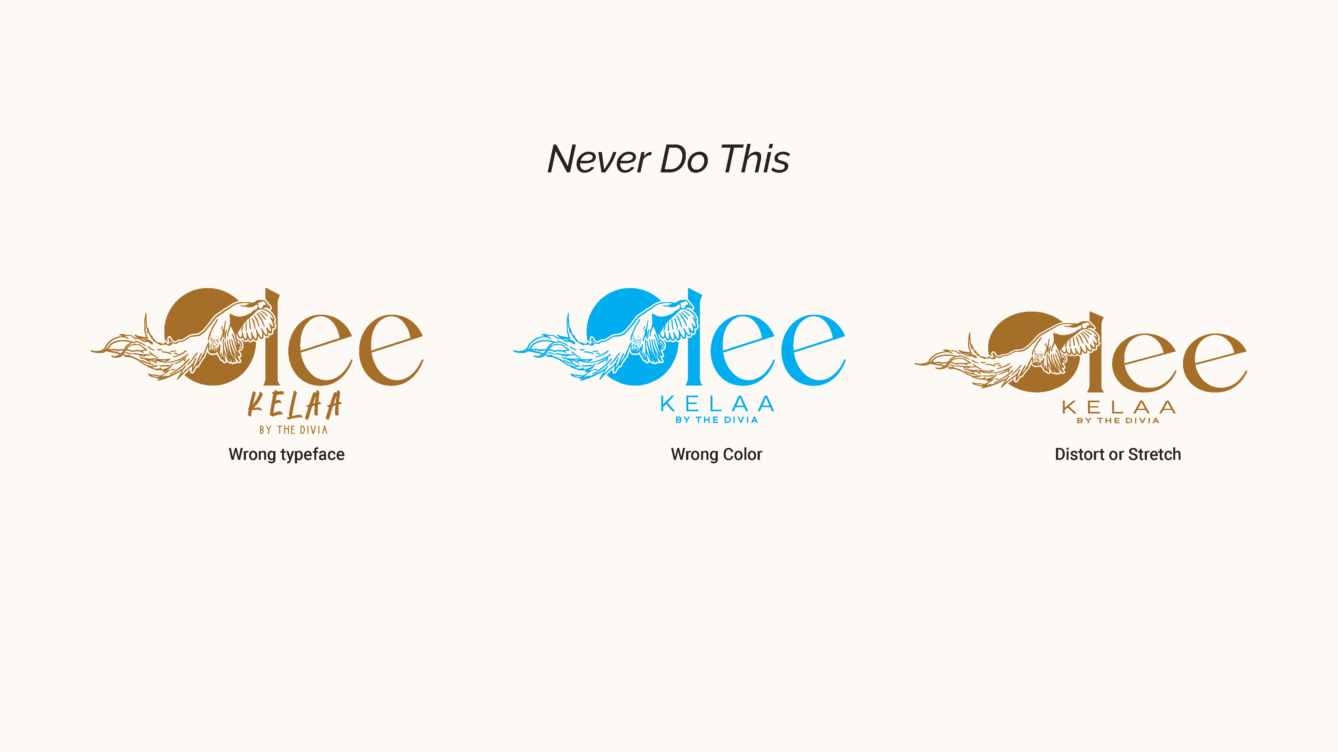
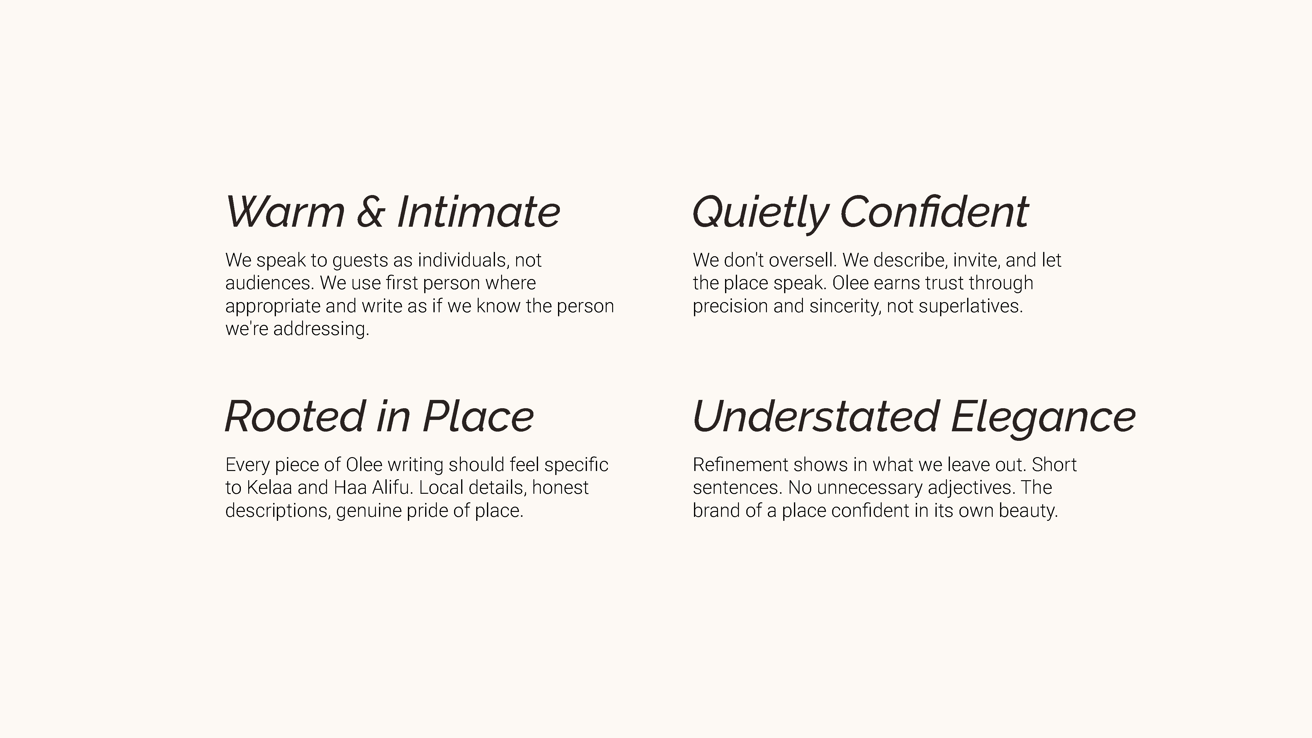
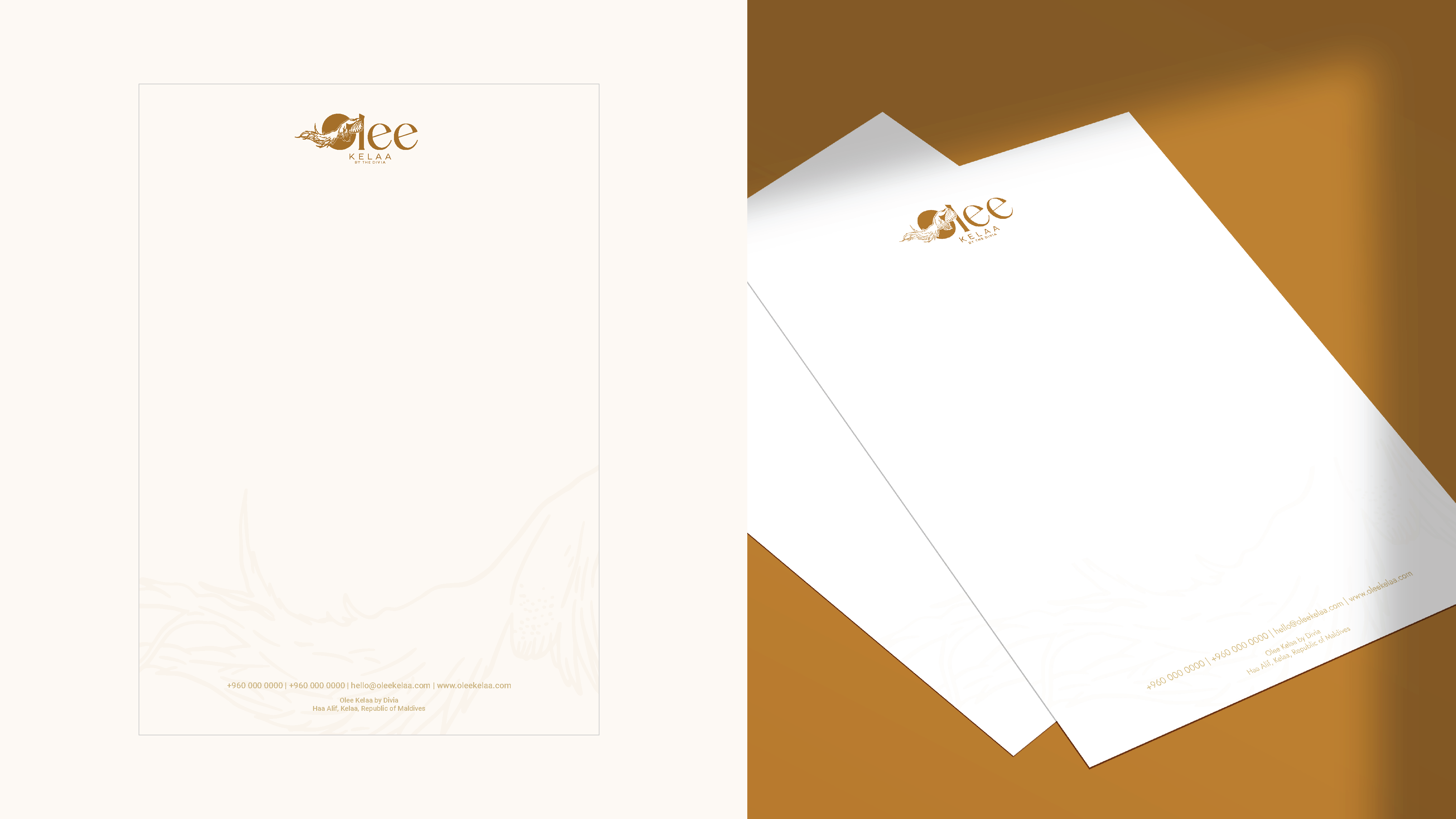
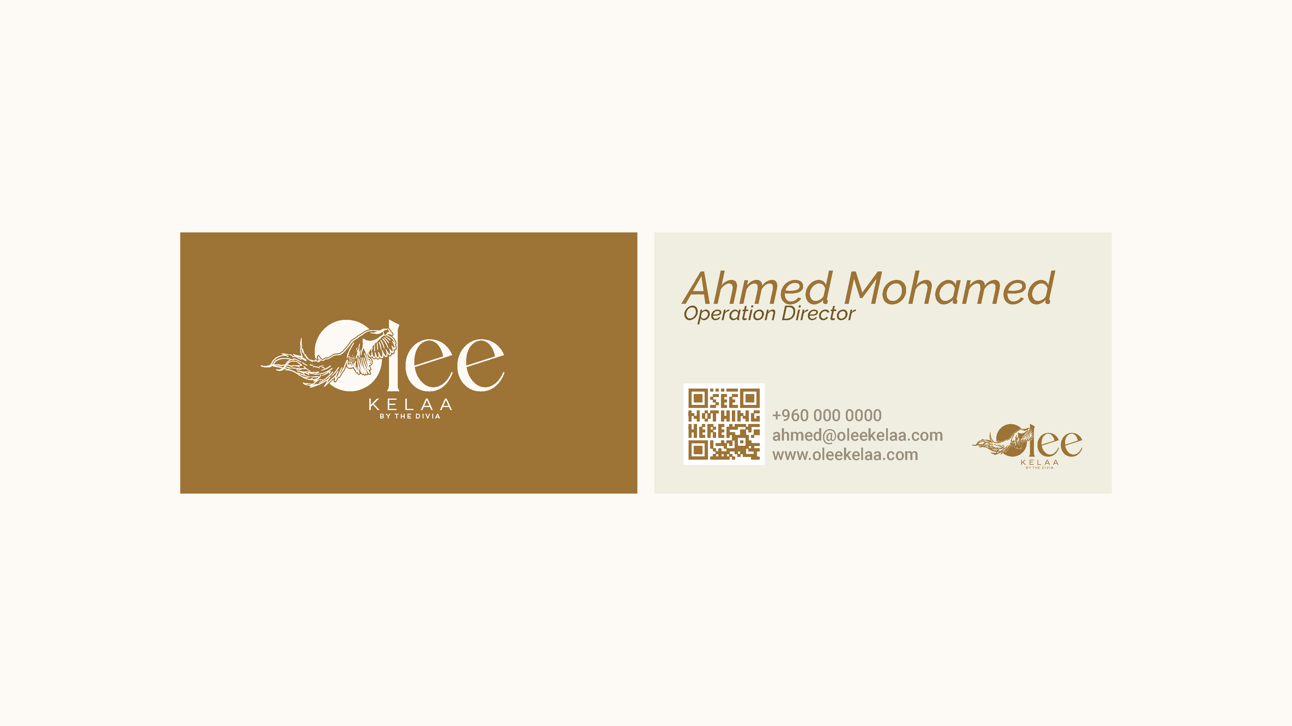
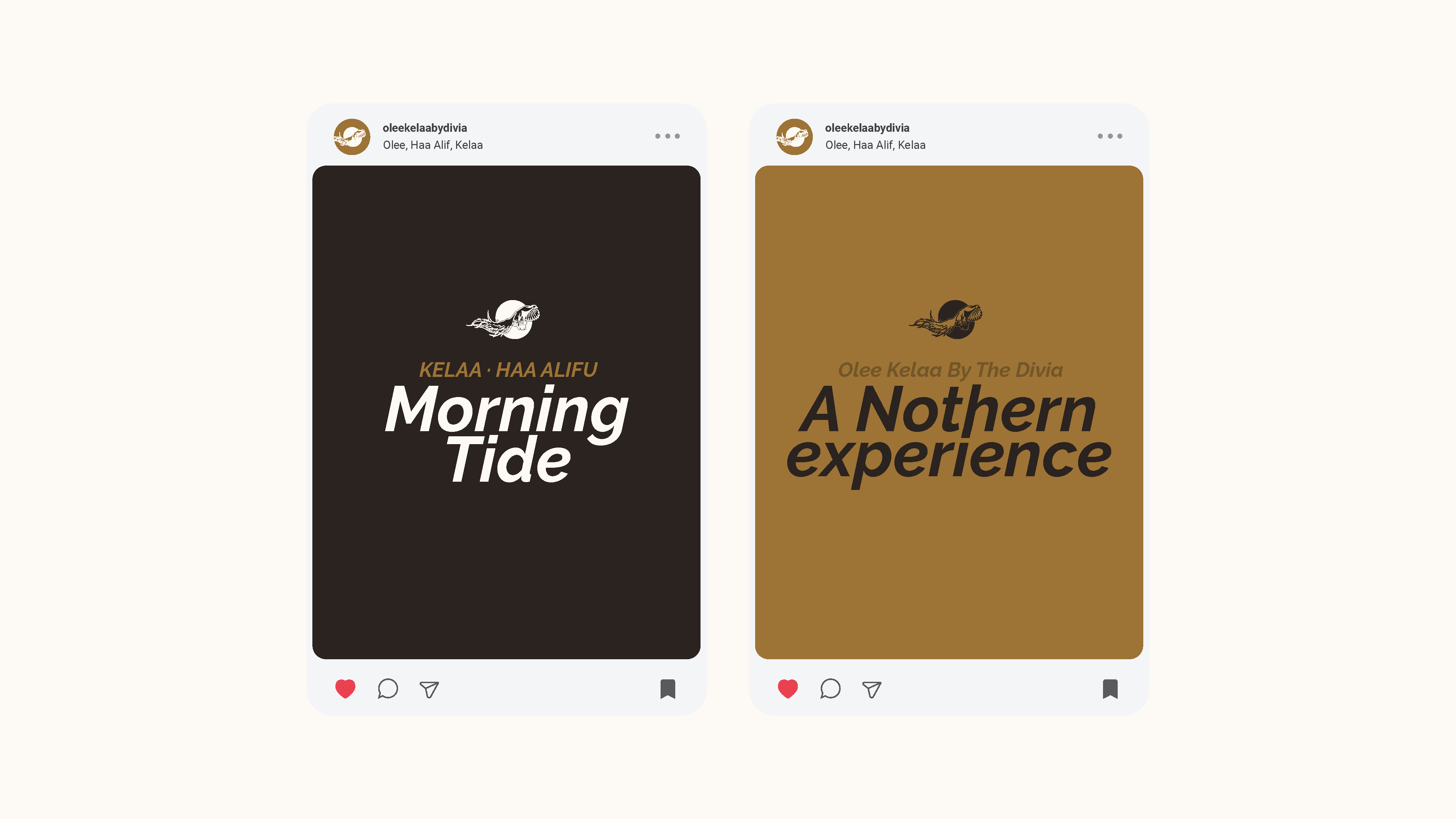
We started from the parent brand and asked what each property should inherit and what it should own. Every property keeps The Divia’s bird mark. What sets Olee apart is its location color, so gold became the one signal that says this is Kelaa. Color: One gold, Olee Gold (#a46f29), leads the palette. Deep Amber, Driftwood and Sea Salt frame it, and a seven-step tone scale gives designers room to work without leaving the family. Type: Two typefaces with separate jobs. One carries warmth and elegance in display settings, the other carries clarity in body copy. They are not allowed to compete. Logo: The wordmark, the nesting bird and the KELAA / BY THE DIVIA lock-up work as one unit and are never separated. We set out primary, reversed and one-color versions, and a “never do this” page covering wrong typefaces, wrong colors and distortion. Voice: Four principles: warm and intimate, quietly confident, rooted in place, and understated elegant. Short sentences, no unnecessary adjectives, and writing that reads like a letter by hand rather than a form filled in by an algorithm. Applications: Letterhead, business cards and social templates, tested so the system holds across print and digital.
The result
Olee Kelaa now has a complete identity system, delivered as a brand standards guide. It gives the property’s team and any future designer what they need to stay consistent: the logo suite and usage rules, the color and type system, a voice guide, and ready examples of stationery and social. The property sits clearly within The Divia family while reading as its own place. Two things to check before this goes live: Credit. I assumed the logo and bird mark were supplied by The Divia and that your work was the system built around them. If you created the logo too, add that to the approach. If you didn’t, keep the wording as it is, because overclaiming on a public portfolio is worse than being precise. Outcomes. I kept the result to what was delivered because I have no numbers. If the property has launched, or you have a client quote, add it. A real line from the client will do more than any wording of mine.
More work.
All work
Have a project in mind?
Tell us what your place needs and we will reply with a proposal.